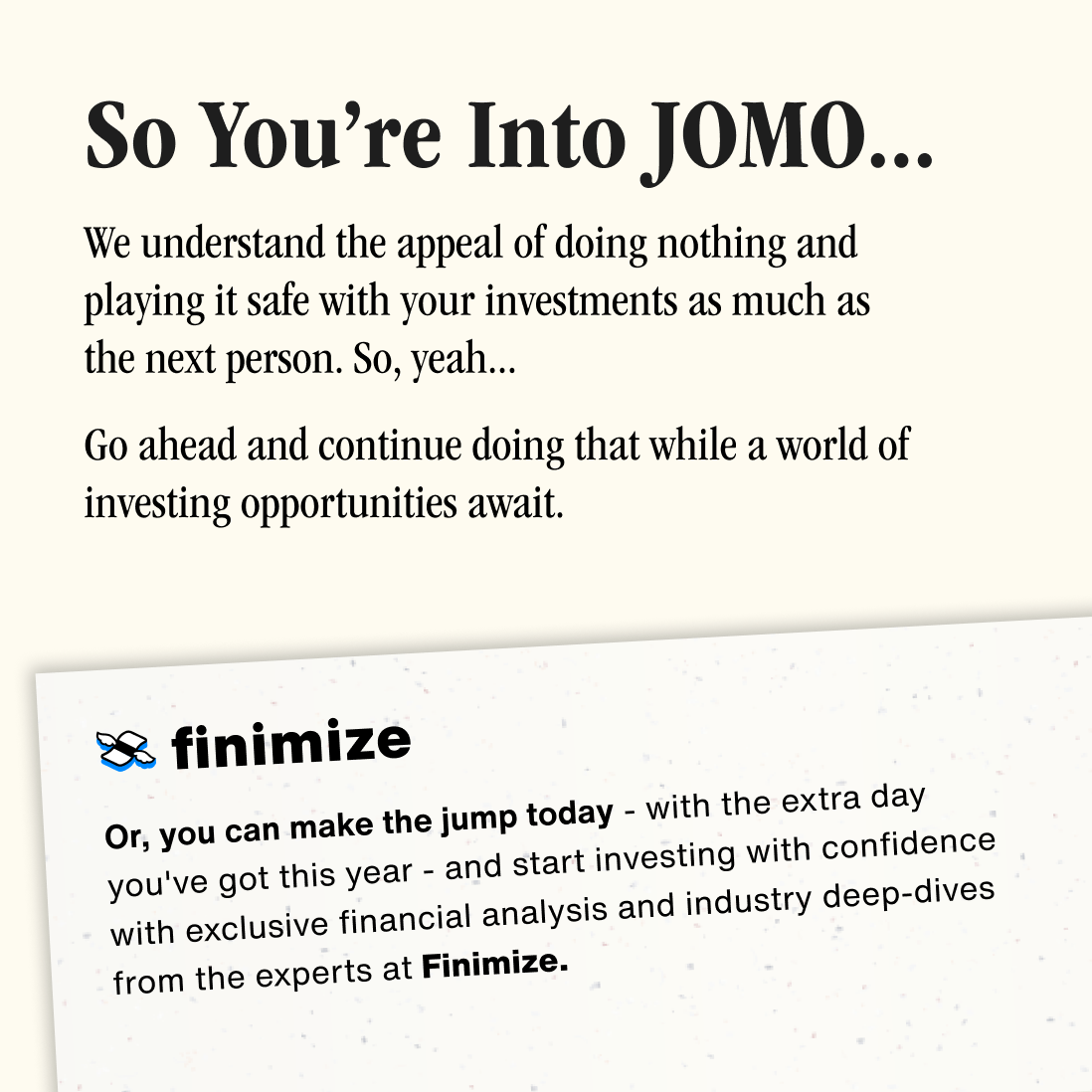
The core idea of "seizing the day" within the context of a Leap Year plays with the unusual nature of an extra day, which in itself is an infrequent and somewhat absurd occurrence. Encouraging people to "take a leap" on this day introduces a sense of playful urgency, asking them to act on opportunities they may otherwise hesitate to engage with. The absurdity lies in using this rare day as a symbol for taking bold financial risks—something that is paradoxical in a traditionally conservative field like finance. By encouraging users to "seize the day" and take financial risks they might not normally consider, Finimize aligns its campaign with its broader mission of democratising investing.
In this context, the clean, Helvetica Finimize logo becomes a tattoo, transforming into a symbol of boldness set against the backdrop of motorcycles and skydivers, embodying the spirit of risk-taking and adventure.
While the main Finimize branding emphasises clarity, accessibility, and consistency in its visual language, the Carpe Diem campaign branding diverges from Finimize’s core identity by adopting a thrill-seeker theme, evoking a sense of adventure. The campaign brings a tactile, rustic feel, drawing on imagery like newspapers and a worldly, on-the-road aesthetic. Where Finimize’s visual identity focuses on accessible, modern financial insights, the campaign’s branding embraces a raw, adventurous energy, creating a sense of freedom and exploration far removed from the usual digital-first, minimalistic look. This helps Finimize tap into a broader emotional appeal. In this context the clean, Helvetica Finimize logo becomes a tattoo
The roles involved leading the creative direction and shaping the overall visual identity. This included not only designing and supervising multi-channel assets, but also ensuring cohesive alignment across platforms. The role also encompassed copywriting, where the tone and messaging of the campaign were crafted to align with the adventurous, bold theme. Additionally, responsibilities included the development of templates and managing the integration of the brand’s visual language into the microsite, newsletters, and digital marketing collateral. Close collaboration with the design and marketing teams throughout the process ensured the campaign's creative vision was consistently executed across all platforms.
“By the way, did you notice our sweet tat? 💪🏽”
The copywriting role involved more than just writing the content—it was about shaping the overall tone of voice for the campaign to reflect Finimize’s brand while aligning with the absurdity of the campaign. This required developing messaging that was engaging, conversational, and approachable, but still communicated the core values of financial empowerment. The copy had to resonate with a diverse audience, from hesitant first-time investors to those looking to enhance their strategies.
Additionally, the integration of copywriting into multi-channel assets was crucial. The tone was consistent across the microsite, newsletters, and digital content, ensuring a unified message that encouraged action in a playful yet meaningful way.
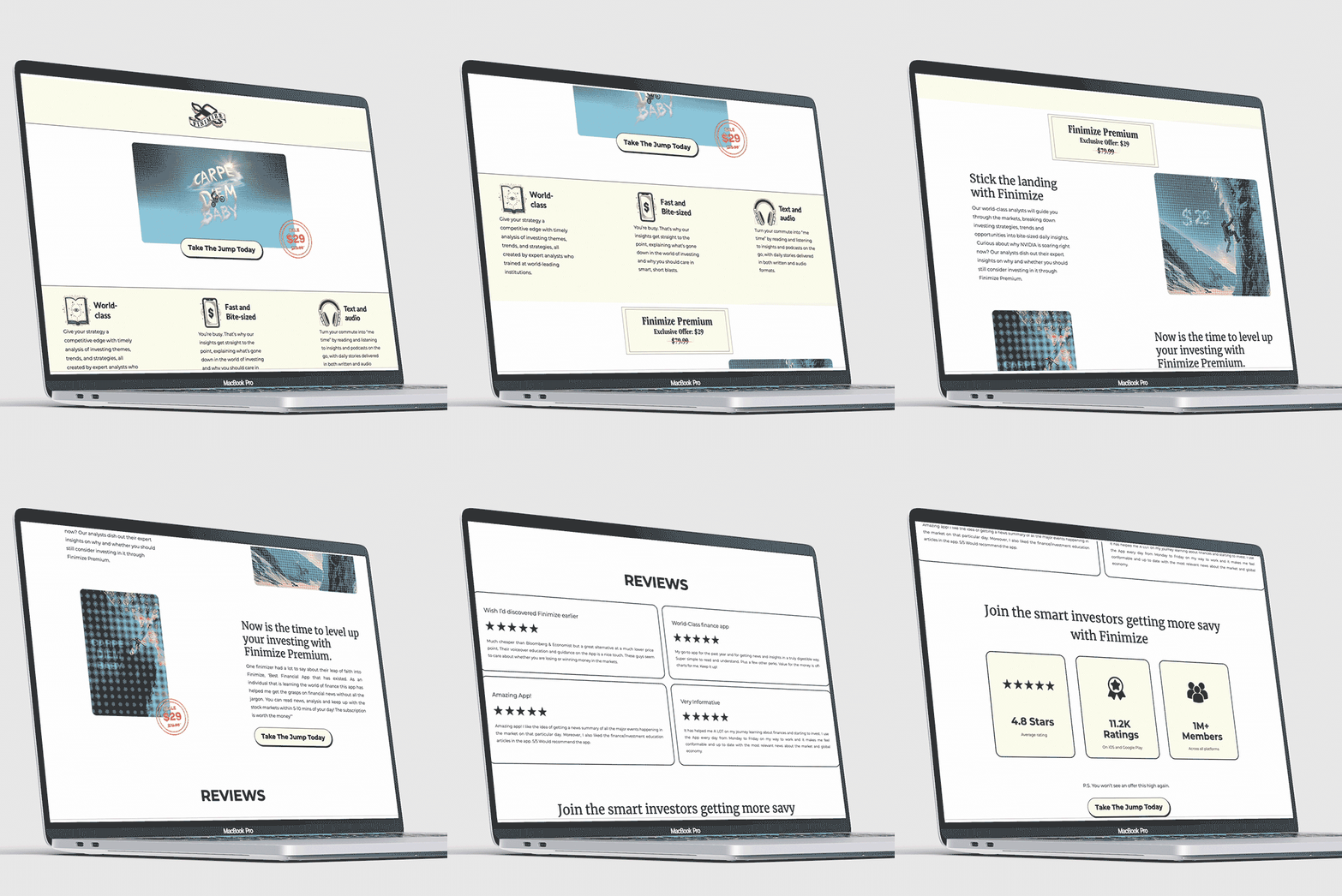
The campaign’s microsite and email design worked hand in hand to inspire action and convey the adventurous spirit of the Leap Year.Both channels maintained a cohesive visual and tonal identity—rooted in the idea of stepping out of your comfort zone—that encouraged users to seize the moment with Finimize’s expert insights and guidance.


