Project Overview: Finimize Rebranding
Finimize began as a finance newsletter in 2016, evolving into a robust content app and community platform over five years. This growth has allowed Finimize to develop a deep understanding of its audience's investing habits and media consumption, creating a modern, intuitive investment information platform. Finimize’s content is known for being nimble, relatable, and actionable, making it easier for users to build their investment knowledge and make informed decisions in just a few minutes a day. The brand's friendly, intelligent, and humour-infused personality has been central to its appeal, fostering a strong connection with its audience. Reaching 1 million users is a testament to the brand's ability to fill a gap in the market, providing accessible investment insights to a new generation of investors.
The rebranding project was executed in-house, supported by freelance brand strategists and my responsibilities for visual direction and brand implementation concluded in May 2024. We adopted an unorthodox approach, allowing certain elements of the rebrand to be introduced and refined throughout its implementation. This iterative process was partly driven by resource constraints, enabling the brand’s identity to evolve naturally as it was applied across various touch-points.
The rebranding aimed to create a premium look and feel for Finimize while maintaining its core values, after its acquisition in 2021. The focus was on elevating the visual identity to better compete with established financial media like Financial Times, Bloomberg, NYT, Forbes, and the Wall Street Journal, while preserving Finimize's approachable and friendly nature.
Unlike the more formal tone of its competitors, Finimize needed to retain a community-driven feel while introducing a polished, sophisticated design. The rebrand targeted investors who are neither beginners nor experts—who value independent decision-making in their investments.
Finimize positioned itself as a platform offering high-quality, digestible insights alongside an engaged global community, setting it apart as a refreshing alternative in the crowded financial information space. The rebrand emphasised insightful, accessible content that embodies the spirit of Finimizers—people seeking control over their financial futures in a democratised environment.
Work-stream Objectives and Creative Deliverables: Visual Identity
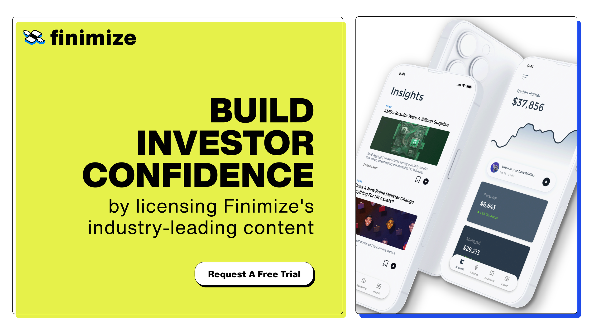
The visual identity overhaul introduced a range of design directions that reflect Finimize's brand personality and its focus on empowering users. The chosen design approach blends clean, modern design with a touch of playfulness through the use of bold typography, memorable catchlines, and graphic elements like collages, illustrations and scribbles. It also incorporates textures that give a nod to print media that make up the whole of its competitors. The branding balances a premium look with approachable tones that make financial insights accessible. This combination aligns Finimize closer to industry players while maintaining a more relatable and user-friendly aesthetic.
Logo
The rebranding of Finimize included a logo refresh, retaining the original logo’s core characteristics while being refined for better typography, improved kerning, and a more polished icon. These adjustments ensure the logo is versatile across different mediums, evolving into a responsive design with tailored variations that adapt seamlessly to various digital and print formats.


The Finimize logo has been refined for clarity and adaptability. It includes primary and secondary versions as well as a standalone icon to ensure flexibility across different platforms. Maintaining clear space around the logo is crucial, as is adhering to size restrictions to ensure readability. The rebrand also introduced variations for sub-brands, such as Finimize Business and Finimize API.
Colour Palette
Main colour palettes are mainly made of blue, reflecting a sense of trust and modernity as well as linking the new branding to its earlier version.
Chartreuse Yellow adds a vibrant touch, balancing the more subdued tones and offering flexibility for graphical elements and accents. It also stands out more prominently in API-related assets, drawing inspiration from the nostalgic look of old MS-DOS screens and the classic green code aesthetic.


Typography
The typography is centered around Helvetica Now and Inter, offering a clean, professional look that ensures readability across digital and print materials. Helvetica Now is used for primary branding, offering versatility with its range of weights, from bold display fonts to micro fonts for smaller text. Trispace, a monospace font with a retro-tech feel, is used sparingly to add a unique touch without overwhelming the overall design.
Inter was incorporated into the Finimize typography system to ensure clear readability and easy navigation across digital formats and products, making longer texts and detailed content more accessible to users throughout the app and website.


Design Elements
The design system uses rounded CTA buttons, black 1pt illustrations, and halftone elements to create a cohesive, analogue-meets-digital aesthetic. This ensures a visual language that is modern yet approachable, maintaining brand consistency across digital and printed platforms.
Image Style
Imagery in Finimize’s visual identity is categorised into collages, abstracts, portraits with gradient backgrounds, photography with halftone treatments, and illustrations. Each style serves to enhance the brand’s personality. Consistent use of treatments like noise filters helps maintain a cohesive and polished look across all platforms.
The pre-AI editorial image style played a particularly critical role in shaping Finimize’s daily interaction with its audience, as these visuals accompany the newsletter and stories that users engage with regularly. Given that subscribers are exposed to these images every day, the style and tone of editorial visuals are essential for maintaining Finimize’s connection with its audience. Previously, the imagery was reminiscent of The Onion-style articles, featuring heavily photoshopped, pun-driven visuals that leaned more towards overt humor. However, the rebranding introduced a more refined approach that aligns with Finimize’s updated identity while retaining an engaging, down-to-earth character. Variety in image styles—while maintaining consistency—was essential to making the previously monotonous news feed, dominated by a repetitive single-image style, more engaging and visually interesting.
For a deeper look into this check out Editorial Images.
Expansion into Marketing Campaigns
The rebrand extended to marketing campaigns across both B2B and B2C markets, ensuring each campaign had its own distinctive visual identity while staying true to the overarching brand. The new visual language was applied to a range of assets, from digital advertisements and social media graphics to email marketing and video content, ensuring a seamless transition to the new brand identity.
A selection of integrated marketing campaigns can be found under Creative Direction and Campaign Design on my home page.
Podcast cover artwork for Generation podcast by Finimize
Application Across Platforms
The updated branding was meticulously integrated across all Finimize touchpoints:
Product: A refreshed app interface improved usability and visual appeal.
Website: Redesigned for clear navigation, updated typography, and more engaging visuals.
Newsletters: As one of Finimize’s core communication channels, newsletters were rebranded to include the use of consistent color and typography alongside the updated image styles; enhancing readability.
Reports & Events: Applied new branding to financial reports, summits, and events, maintaining clarity even in technical content.
Social Media: A revamped Instagram identity with dynamic graphics and fresh content formats connected better with the audience.
Instagram:
For the Finimize case study, the focus on Instagram was all about leveraging the content we already had, transforming it into a daily, digestible presence. With a steady stream of news, insights, and quick takes being produced for newsletters, it was simply a matter of condensing these into visually engaging posts. This allowed us to share market updates, quotes, sponsored content, and financial insights directly on Instagram, providing significant value without needing additional content creation.


To make the most of this, I developed an in-depth Instagram identity that is both visually striking and designed to retain user attention. The new identity merges clean, contemporary design with dynamic storytelling, ensuring that Finimize’s feed not only delivers valuable information but also stands out aesthetically in users’ feeds. This cohesive look and feel allowed us to effectively amplify content and engage with the community in a way that felt fresh and relevant.
The comprehensive rebrand not only unified the visual identity of Finimize but also reinforced its position as a leader in the investment space, offering modern investors a reliable, approachable, and engaging platform to build their financial knowledge as well as organising the world largest annual retail investor event.
Conclusion
The rebranding of Finimize aimed to reshape how the brand communicates its value to modern investors, positioning it as a trusted partner in their financial journey. By balancing a friendly, inviting tone with a refined visual identity, the rebrand succeeded in appealing to Finimize's diverse audience—those seeking to invest confidently without feeling overwhelmed. The result is a cohesive brand identity that not only resonates with existing users but also attracts a new generation of investors looking for a fresh perspective in the financial space.


