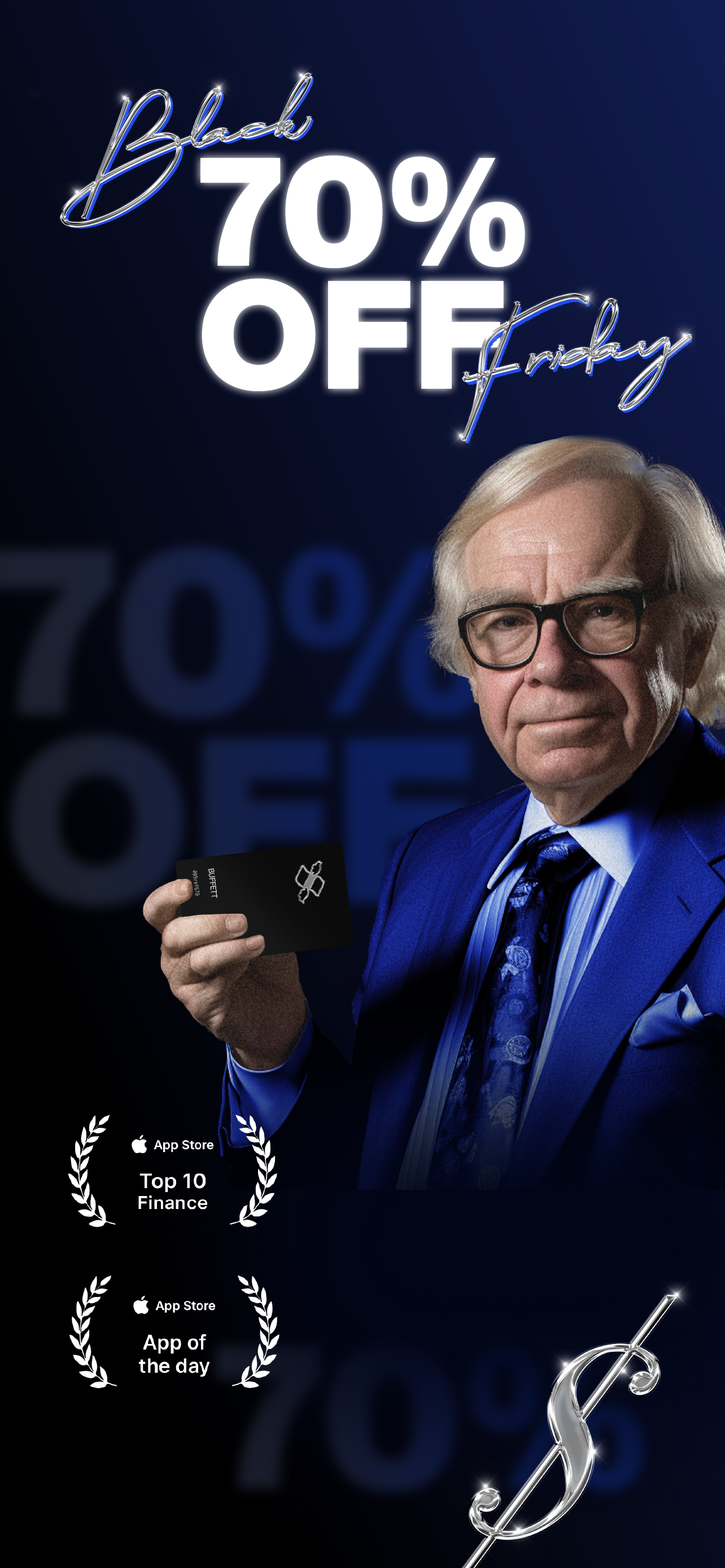
Finimize’s Black Friday Campaign places absurdity at its core, embracing the trope of hyper-consumerism in an exaggerated, almost parodic fashion. Leaning into an 80s hyper-consumerism aesthetic, the campaign showcases maximalist design elements, featuring chrome accents set against a dark, black-and-blue backdrop that subtly nods to the Finimize brand colors. The visuals, while bold and over the top, create a stark contrast with the more polished, minimalist look typically associated with Finimize’s branding.
At the heart of the campaign is the shameless promotion of an imaginary "Finimize Black Card," flaunted by the mega-wealthy in a humorous, tongue-in-cheek way. The tone flirts with satire, cleverly mocking traditional capitalist excesses while presenting a compelling offer. The exaggerated nature of the campaign, while rooted in absurdity, ultimately contributes to building Finimize’s persona as the clever, witty friend who offers financial insights with a hint of humor.
Even though the campaign boils down to offering discounted services, its clever use of aspirational marketing helps position Finimize as more than just a financial platform—it becomes a relatable and engaging brand, appealing to users’ emotions through humor and satire.
In this campaign, the role involved leading the creative direction and shaping the visual identity. The design focused on developing multi-channel assets, including digital and promotional content that aligned with the campaign’s over-the-top aesthetic. Key responsibilities included supervising the execution of templates and overseeing the integration of the campaign’s absurdist tone across the microsite, newsletters, and various marketing collateral. Collaboration with the design and marketing teams ensured that the campaign maintained its humorous, yet aspirational, tone while staying consistent with Finimize's overall branding.
This approach helped differentiate the campaign from typical Black Friday promotions, engaging the audience in a more memorable, engaging way.


